
Children’s Hospital of Michigan – Security Signage Refresh
When you walk into a hospital, the first thing you should feel is safe — not stressed.
Children’s Hospital of Michigan wanted to update their security signage to clearly communicate rules and make the space feel friendlier for kids and families.
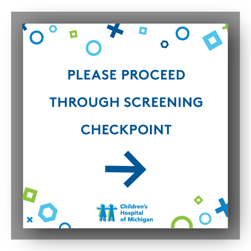
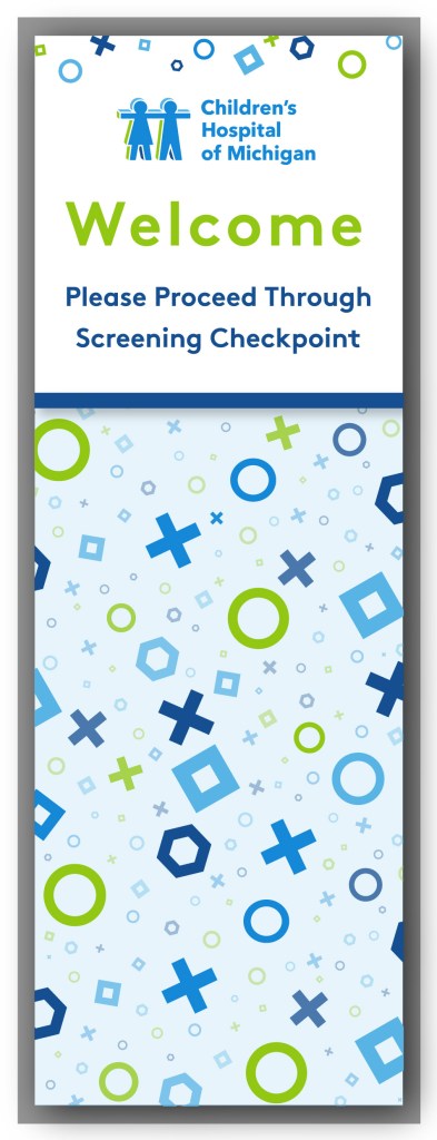
My Approach: I designed large-format signs using CHM’s bright palette, bold typography, and playful shapes to keep instructions clear from a distance while softening the tone visually.
The Heart of It: Visitors are now greeted with confidence and compassion from the very first step inside.This signage is about more than directions — it’s about reassurance.
Mr. Bryen’s Ice Cream Cart – Children’s Hospital of Michigan
Inspired by Mr. Bryen’s legacy gift to bring ice cream to patients, families, and staff each year, this cart needed to be as joyful as the tradition itself. The client envisioned a Candy Land-inspired world — but instead of gumdrops and lollipops, it would be filled with ice cream dreams.
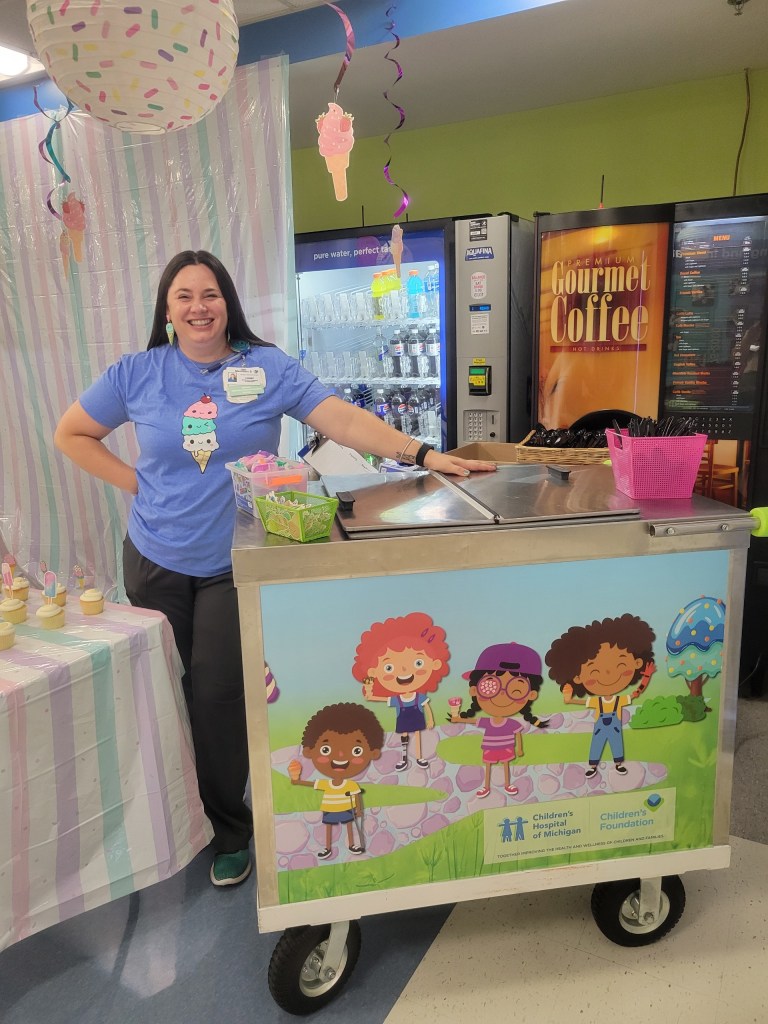

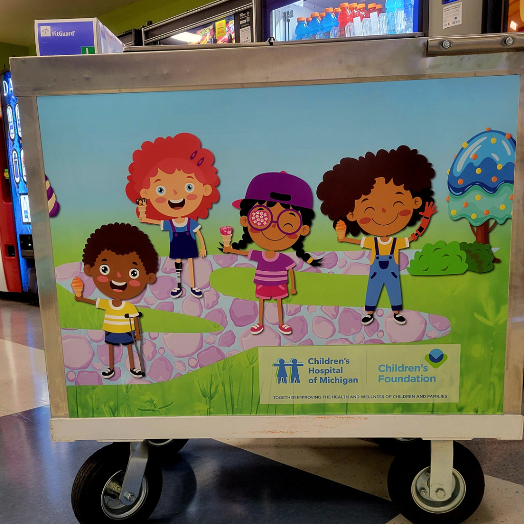
My Approach: I illustrated whimsical characters and landscapes of popsicle trees and ice cream treats galore, all while staying consistent with CHM’s brand identity.
The Heart of It: The cart has become a highlight at celebrations, sparking smiles with every scoop and serving as a cheerful reminder of Mr. Bryen’s generosity.This cart isn’t just a piece of equipment — it’s a rolling celebration of generosity, joy, and of course ice cream!
Phlebotomy Department Poster – How to Prevent Fainting
This educational poster helps staff quickly communicate prevention steps for young patients getting blood draws.
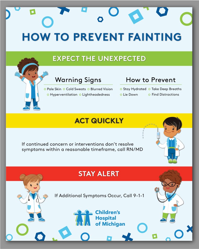
My Approach: Brand-consistent colors and kid-friendly illustrations make the information approachable and engaging while reducing anxiety for children.
The Heart of It: By turning important medical information into something bright and friendly, it helps young patients feel at ease during a moment that could otherwise feel scary.
DMC & CHM Staff T-Shirt Designs
Branded apparel designed for both team spirit and public visibility.
For the Detroit Medical Center, bold type treatments in signature DMC blue reflect professionalism and strength, while Children’s Hospital of Michigan’s shirts feature playful shapes and bright colors to match their kid-focused brand.
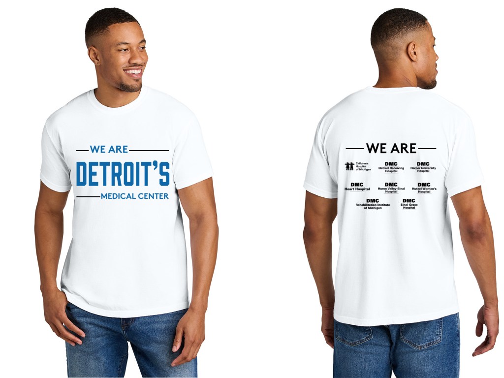
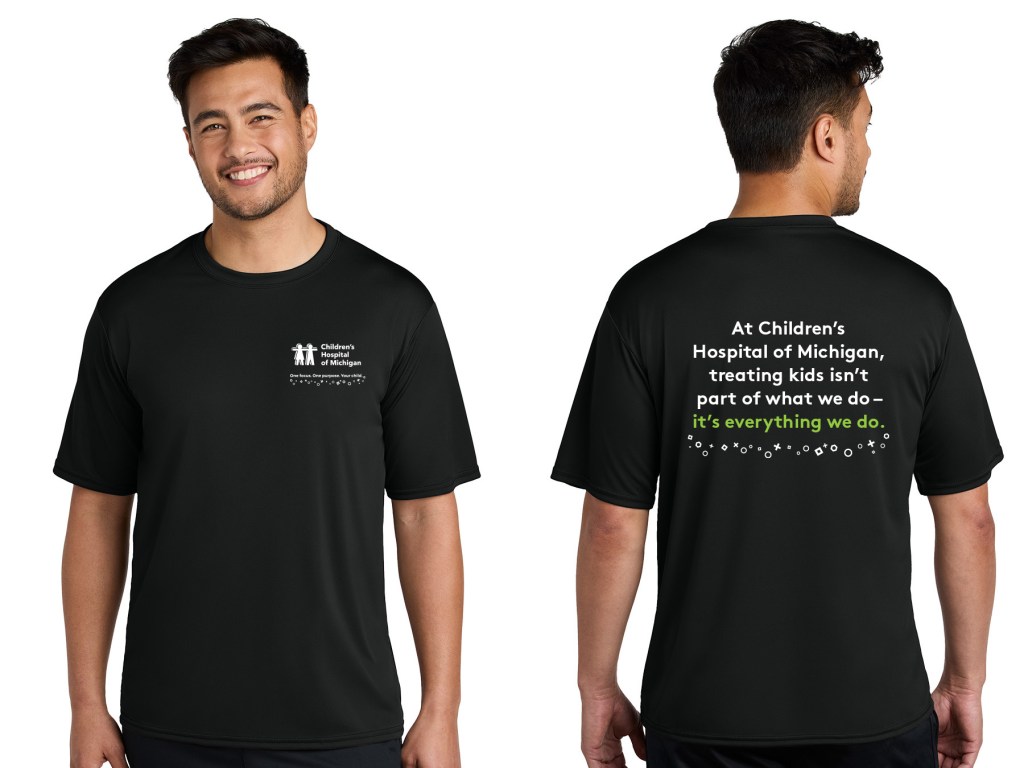
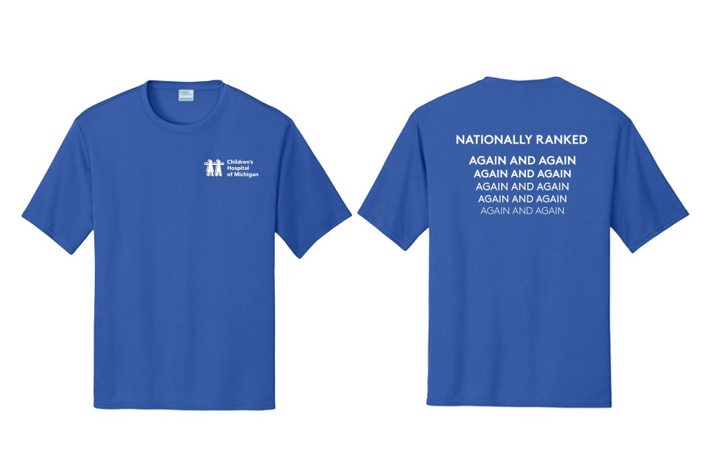
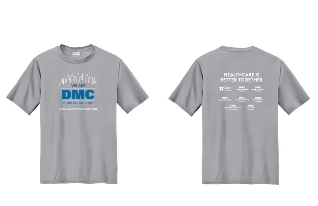
My Approach: These designs aren’t t-shirts — they’re statements of belonging. Every shirt was created to be comfortable, eye-catching, and optimized for screen printing so colors and details stay vibrant wear after wear.
The heart of It: Both hospitals share a deep love for Detroit and pride in serving its people. These shirts let staff wear that pride on their sleeves — literally — celebrating the city they call home and the community they care for every day.
Pediatric Nursing Conference Brochure
This multi-page brochure supports CHM’s annual conference, highlighting speakers, agenda, and CEU details.

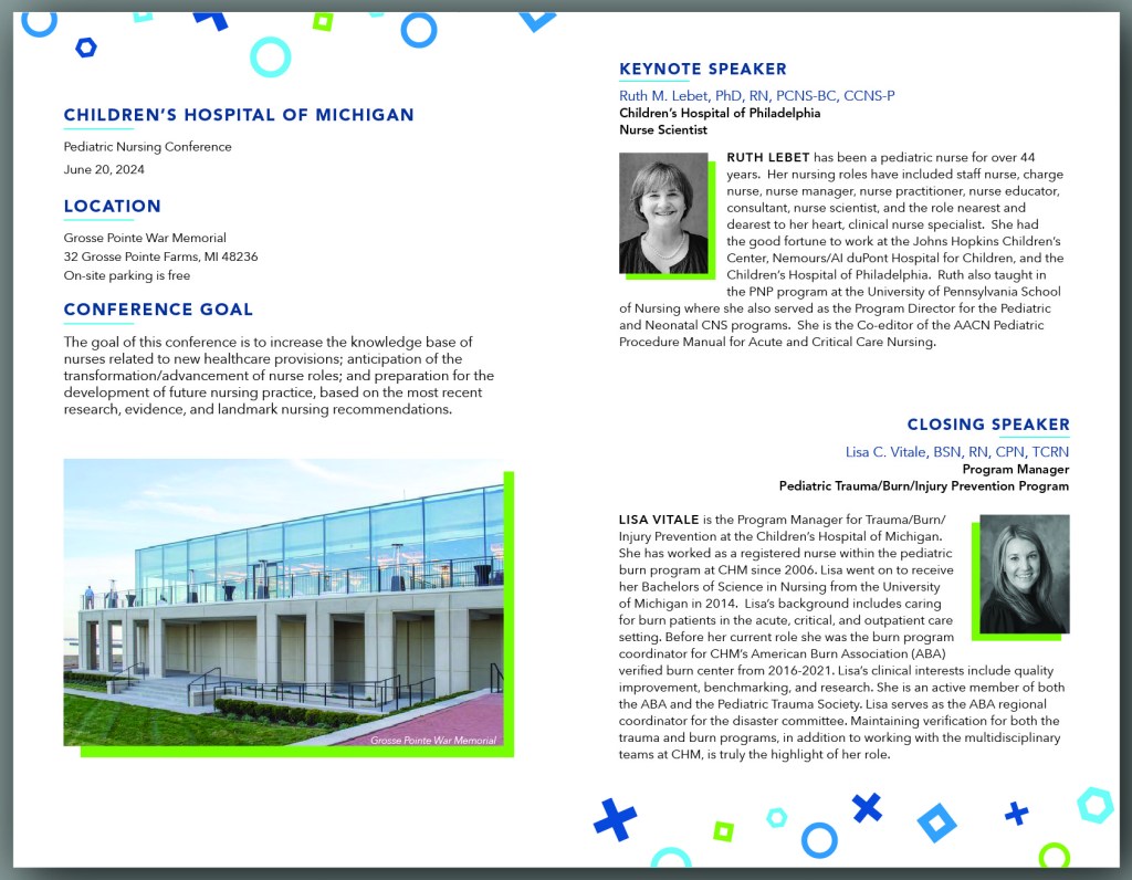
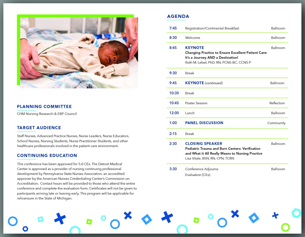
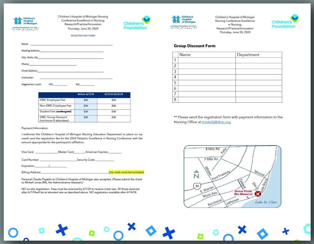
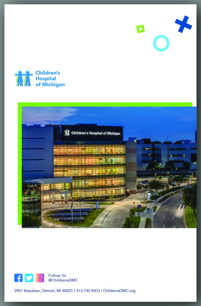
My Approach: Clean, professional layouts paired with the hospital’s bright colors create a piece that’s informative, approachable, and visually aligned with the brand.
Result: A polished, engaging tool for attendees and a reflection of the hospital’s dedication to pediatric care.
DMC Conference Room Mural – Detroit Pride
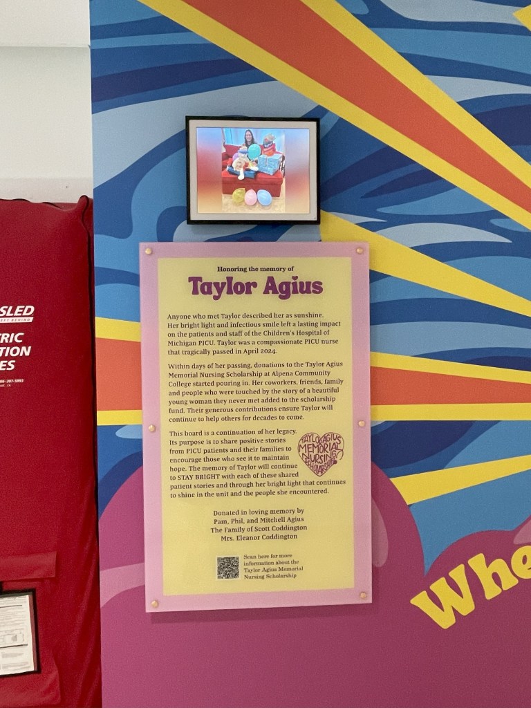
When the Children’s Hospital of Michigan PICU team lost one of their own, they sought a tribute as extraordinary as the nurse they loved. Taylor Agius was sunshine in scrubs — a compassionate caregiver whose smile and dedication touched countless lives. After her passing in April 2024, the hospital wanted a space that would both honor her memory and continue her mission of bringing hope to patients and families.
The result is a heartfelt installation featuring illuminated PICU PROUD channel letters, four glowing frames for “Little Hero” success stories, and a digital photo frame filled with candid moments and cherished memories. Together, they ensure Taylor’s light continues to shine in the place she loved most.
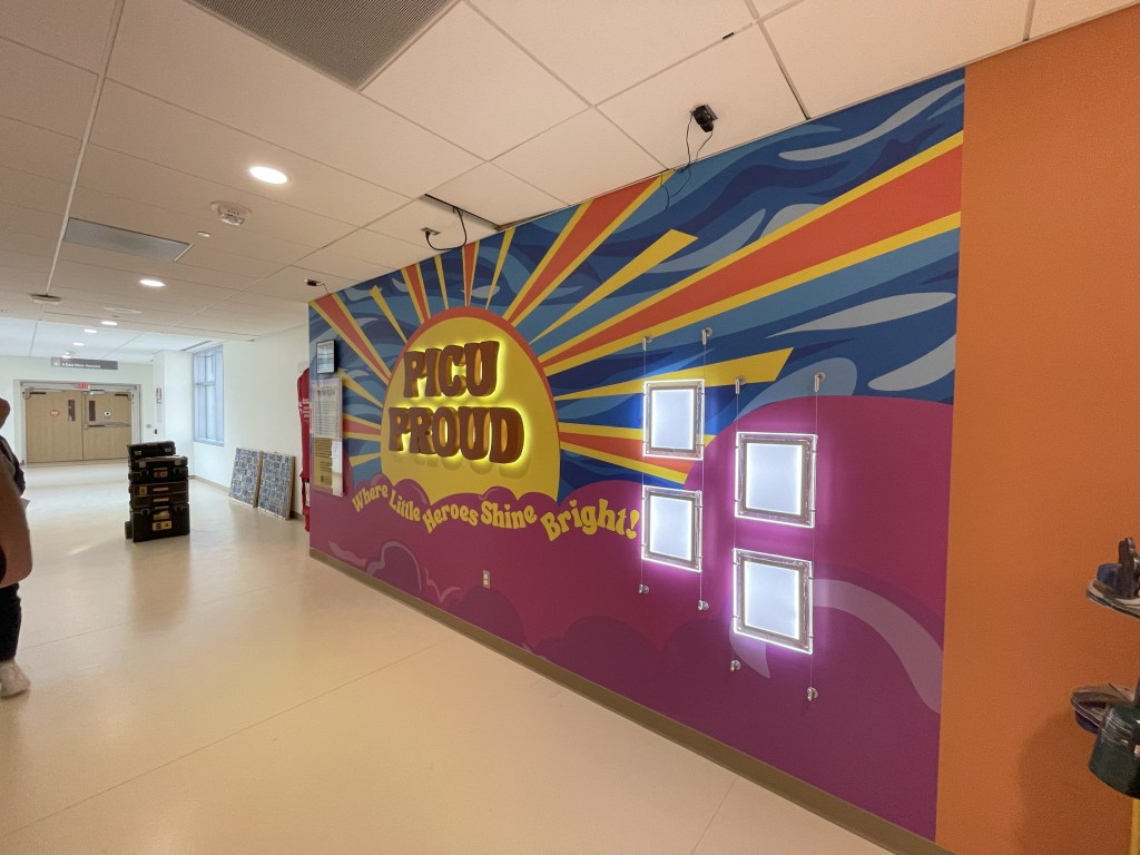
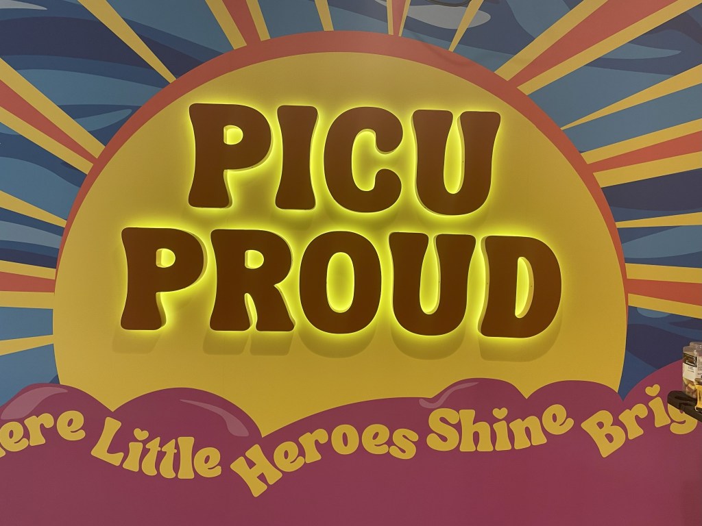
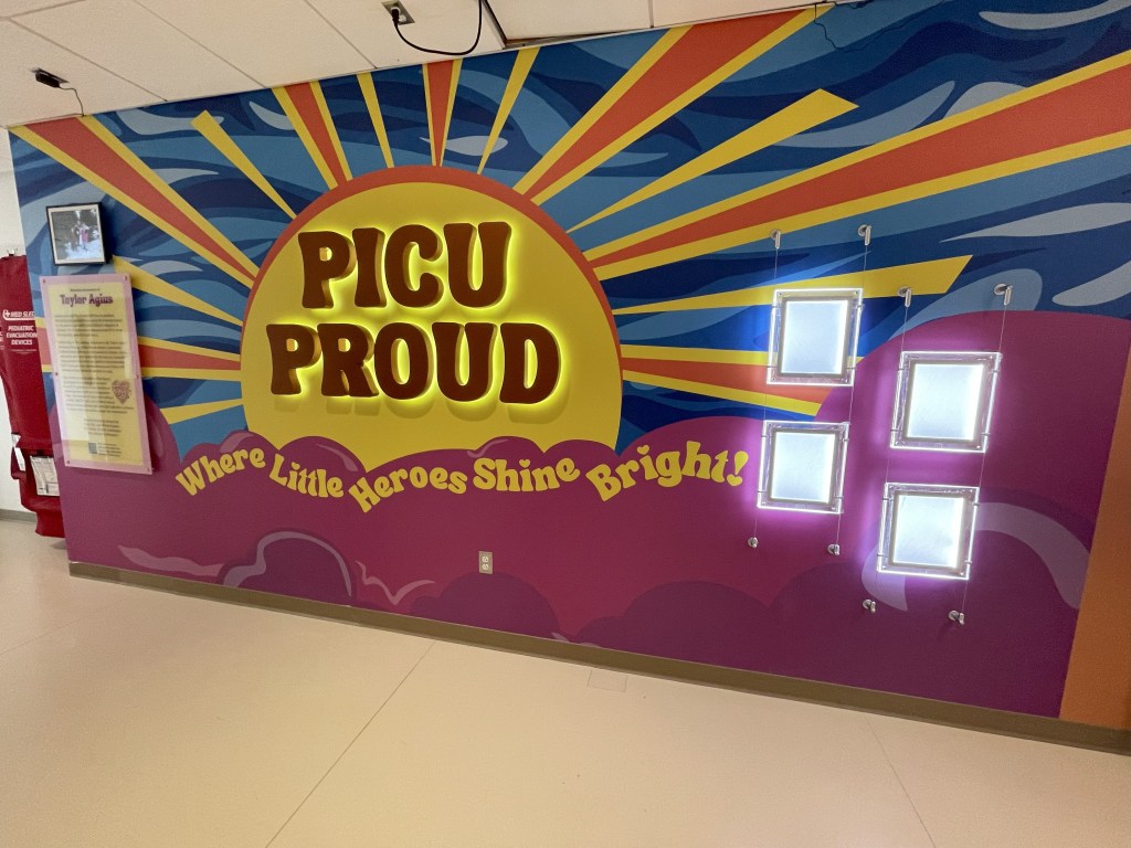
My Approach: This project demanded more than design skill — it called for empathy, sensitivity, and a deep understanding of the PICU’s spirit. I created a warm, brand-aligned environment that balanced remembrance with encouragement. The illuminated PICU PROUD letters stand as a bold declaration of pride and unity, while the backlit “Little Hero” frames celebrate patient victories that Taylor would have championed with joy.
The digital photo frame was placed to bring Taylor’s presence into the space, allowing her smile, laughter, and the moments she cherished to greet staff, patients, and families every day. Each design decision was made to reflect her kindness and the hope she inspired, transforming the wall into a living part of the PICU’s healing environment.
The Heart of It: Taylor Agius was more than a nurse — she was a ray of sunshine. This memorial ensures that light never fades. The PICU PROUD display radiates strength, the “Little Hero” frames remind families that recovery is possible, and the photo frame keeps her spirit present in the very halls she walked.
It’s a space where grief meets gratitude, where stories of resilience carry forward her legacy, and where one nurse’s love continues to brighten the lives of everyone who enters.
DMC Conference Room Mural – Detroit Pride
For this Detroit Medical Center conference room, I designed a full-wall collage that celebrates the city’s landmarks, culture, and history — all unified in the bold DMC blue palette. Every element was chosen to honor the deep connection between the hospital and the city it serves.
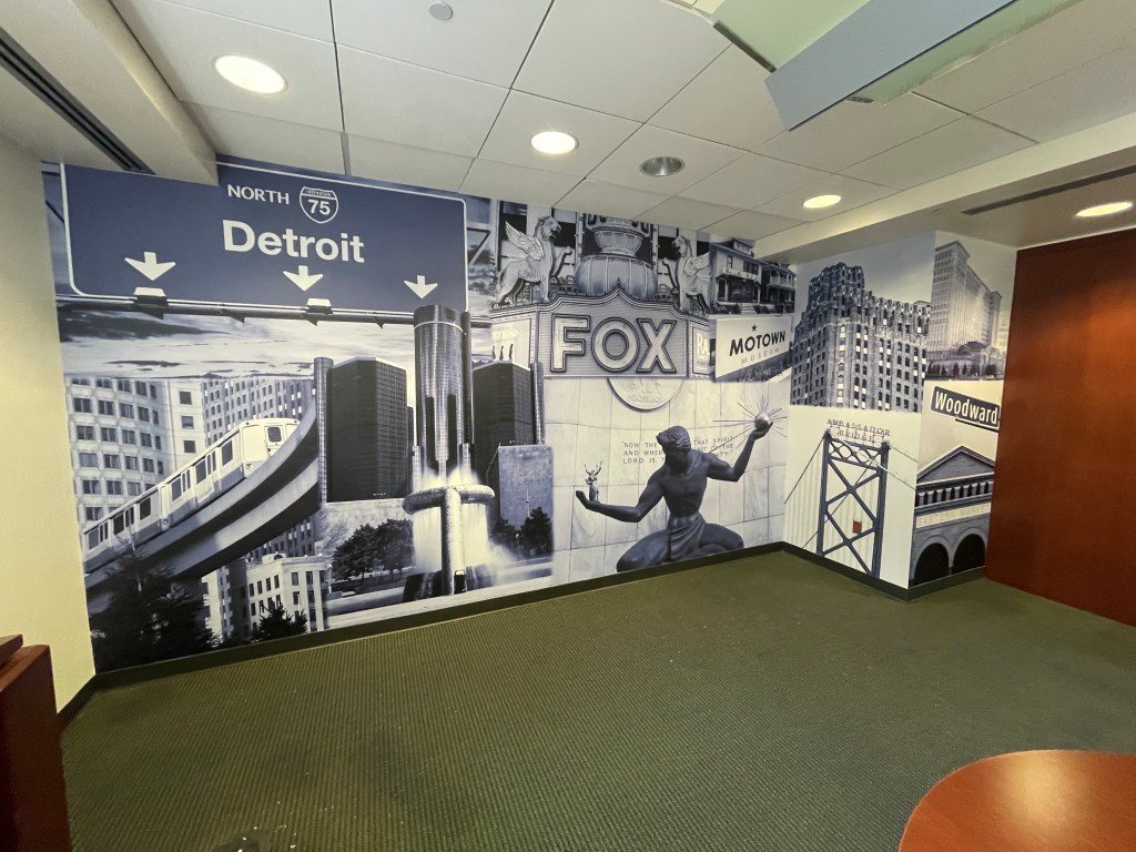
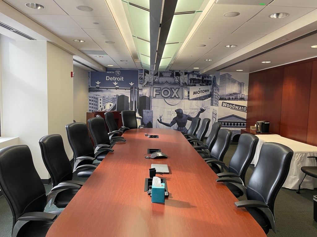
My Approach: An executive space serving as the backdrop for board meetings, video conferences, and leadership presentations — I aimed to create a full-wall vinyl installation that radiates both professionalism and Detroit pride.
The Heart of It: This mural is more than a backdrop — it’s a love letter to Detroit. Every landmark reflects the city’s resilience, creativity, and community spirit, echoing the pride DMC staff carry into their work. Bold and brand-consistent, it ensures every meeting — on-camera or in person — is anchored in the identity of Detroit Medical Center and the city it serves.
DMC Lung Institute Sign – Frosted Glass & Dimensional DetaiL
A modern, welcoming sign for a center of excellence in care.
This project for the Detroit Medical Center’s Lung Institute features a sleek frosted glass panel paired with dimensional standoff lettering to create depth and presence. The design was developed to feel both professional and approachable, in line with DMC’s trusted reputation.
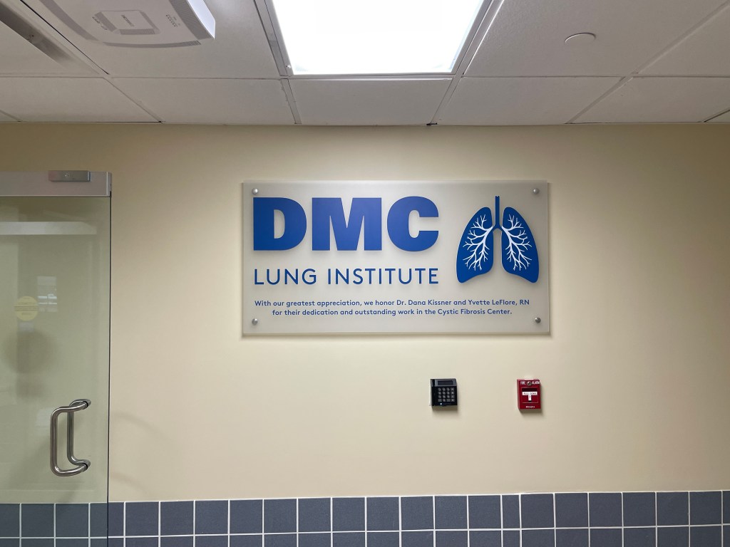
My Approach: Using the brand-approved font and layout specifications, I created a clean, balanced composition that highlights the Institute’s identity while enhancing the space. The dimensional standoffs add a subtle 3D effect, bringing sophistication without overwhelming the environment.
The Heart of It: This sign isn’t just wayfinding — it’s part of the patient experience, offering clear identification while contributing to an atmosphere of calm and care
